20 Best Power BI Report Examples in 2025 with Metrics, Use Cases & Insights
Tarsem Singh | June 6, 2024 , 19 min read
Table Of Content
The ability to extract meaningful insights from data is very important for making successful decisions in business. However, the challenge lies in effectively communicating these insights to stakeholders.
Raw data can be overwhelming and difficult to interpret without the right tools. This is where the power of data visualization comes into play. Visual representations of data not only makes complex information more accessible but also enables better understanding and analysis.
With the growing demand for clear and compelling data presentations, Power BI has emerged as a powerful solution. This tool empowers users to create insightful reports that effectively convey data-driven narratives, making it an indispensable asset in the modern business world.
In this blog, we will be listing down 20 such Power BI reports which you definitely need to have a look at.
Key Takeaways
- The lookup table provides a consolidated snapshot of 20 Power BI dashboards, each addressing unique business needs and KPIs.
- These dashboards span industries such as healthcare, retail, finance, and SaaS, showcasing Power BI’s adaptability across sectors.
- Each example highlights its purpose, core metrics, data sources, and advantages, giving stakeholders a clear value perspective.
- The report examples demonstrate how Power BI transforms raw data into actionable insights, enabling smarter and faster decision-making.
- Together, these dashboards serve as both a reference and an inspiration for organisations to design impactful, custom solutions.
Power BI Report Examples Quick Lookup Table
Here’s a summary of all the 20 Power BI reports and dashboard examples covered in this guide.
| Report Name | Purpose | KPIs | Industry |
|---|---|---|---|
| PPC Dashboard | Optimize ad ROI | CTR, CPC, ROAS | Marketing |
| Sales Dashboard | Track revenue and sales performance | Revenue, Growth Rate, Deal Size, Regional Sales | Sales |
| Customer Churn Analysis Dashboard | Reduce churn and improve retention | Churn Rate, CLTV, Renewal Rate, NPS | SaaS / Subscription |
| Financial Dashboard | Monitor financial health and cash flow | Revenue, Net Profit, Expense Breakdown, Cash Flow | Finance |
| Marketing Campaign Insights Dashboard | Measure campaign performance | Conversion Rate, CAC, CTR, ROI | Marketing |
| Loan Application Analysis Dashboard | Assess loan risk and approval trends | Approval Rate, Loan Size, Default Rate, Risk Score | Banking / Fintech |
| Ecommerce Sales Dashboard | Track online sales and conversion | Sales, AOV, Conversion Rate, Inventory Levels | E-commerce |
| Operations Dashboard | Improve production and supply chain | Production Efficiency, Downtime, Fulfillment, Turnover | Manufacturing / Retail |
| Healthcare Dashboard | Improve patient care and resource use | Admissions, Bed Occupancy, Treatment Success, Utilization | Healthcare |
| HR Dashboard | Track workforce performance and satisfaction | Turnover Rate, Recruitment Efficiency, Satisfaction, Training | Human Resources |
| CEO Dashboard | Provide enterprise-wide strategic insights | Revenue, Profit, Strategic KPIs, Market Trends | Executive / Multi-Sector |
| Pharma Dashboard | Monitor drug development and compliance | Drug Progress, Sales, R&D Spend, Compliance Status | Pharmaceutical |
| Mall Analysis Dashboard | Analyze mall performance and tenant metrics | Sales, Foot Traffic, Lease Occupancy | Real Estate / Retail |
| Retail Analysis Dashboard | Understand customer behavior and inventory needs | Sales by Product, CLV, Foot Traffic, Inventory Levels | Retail |
| Construction Permit Dashboard | Streamline approval workflows | Permits Issued, Approval Time, Status, Project Type | Construction / Government |
| Cancer Analytics Dashboard | Support cancer treatment and research tracking | Survival Rate, Treatment Success, Funding, Trial Enrollment | Healthcare / Research |
| Patient Management Dashboard | Optimize appointment and care schedules | Attendance, Satisfaction, Treatment Success, Wait Time | Healthcare |
| Property Developer Sales Dashboard | Monitor property sales and construction timelines | Sales Volume, Avg Price, Market Trends, Completion Rate | Real Estate |
| Anomaly Detection in Credit Cards | Detect and prevent fraud in transactions | Fraud Rate, Suspicious Merchants, Avg Transaction, Anomalies | Banking / Payments |
| KPI Dashboard | Track high-level business KPIs across departments | Revenue, Efficiency, NPS, Employee Performance | General Business / C-Suite |
Top 20 Power BI Report Examples
These Power BI report examples showcase the diverse applications of this powerful tool across various industries and functions. By learning how to optimize Power BI reports, users can further enhance the efficiency and effectiveness of their dashboards.
From e-commerce sales dashboards to PPC performance analysis and customer churn visualization, these report examples demonstrate the versatility and impact of Power BI in transforming data into actionable insights.
1. Marketing Campaign Insights Analysis Dashboard
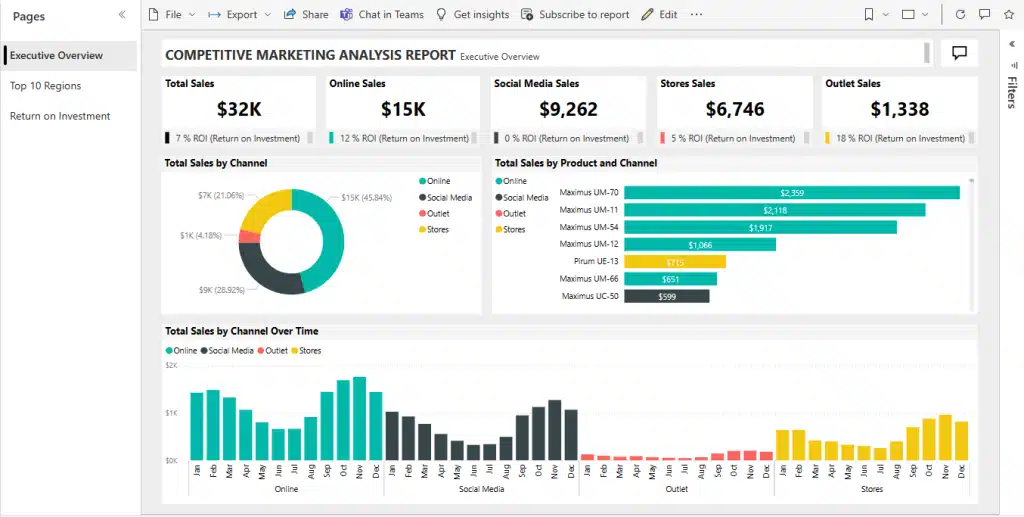
First on our list of Power BI dashboard ideas is the marketing campaign analysis dashboard. This dashboard provides a comprehensive view of marketing campaign performance, including metrics like conversion rates, click-through rates, and customer acquisition costs. It helps marketing teams analyze the effectiveness of their campaigns and identify areas for improvement.
Data Sources:
- Google Analytics for web traffic and user behavior.
- Social media platforms (e.g., Facebook, Twitter) for engagement and ad performance.
- CRM systems (e.g., Salesforce) for lead tracking and conversion data.
- Email marketing tools (e.g., Mailchimp) for email campaign performance.
- Email verification tool (e.g., Smartlead) to quickly verify and score the validity of a contact’s email address.
Key Metrics:
- Conversion Rate: Measures the percentage of users who complete a desired action.
- Click-Through Rate (CTR): The ratio of users who click on a link to the number of total users who view an email or ad.
- Customer Acquisition Cost (CAC): The total cost of acquiring a new customer.
- Return on Investment (ROI): The profitability of the marketing campaigns.
Pro: Detailed insights into campaign performance help optimize future marketing strategies.
Con: Data integration from multiple sources can be complex.
2. Construction Permit Data Analysis Dashboard
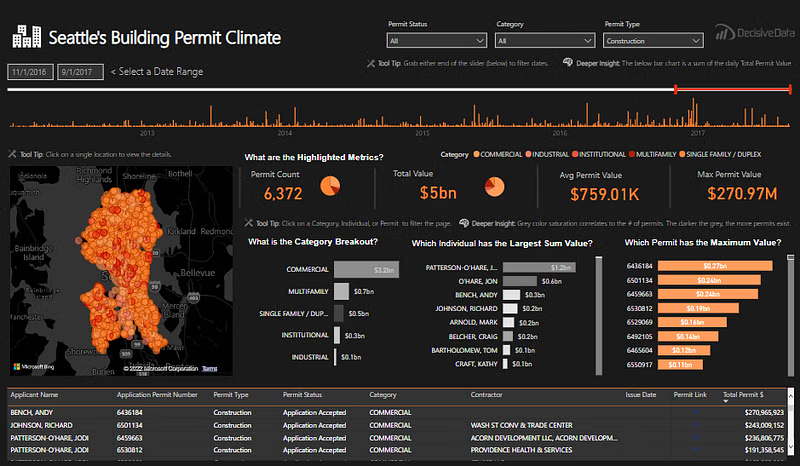
This Power BI dashboard analyzes construction permit data, showcasing trends, approval times, and project types. It is useful for construction companies, urban planners, and government agencies to monitor and streamline the permit process.
Data Sources:
- Municipal databases for permit applications and approvals.
- Government open data portals for historical permit data.
- Internal databases from construction companies for project details.
Key Metrics:
- Number of Permits Issued: The total number of permits granted over a specific period.
- Average Approval Time: The average time taken to approve a permit.
- Project Type Distribution: The breakdown of permits by type (residential, commercial, etc.).
- Permit Status: The current status of permit applications (approved, pending, rejected).
Pro: Helps identify bottlenecks in the permit approval process.
Con: Data accuracy can be affected by outdated or incomplete records.
3. Sales Dashboard
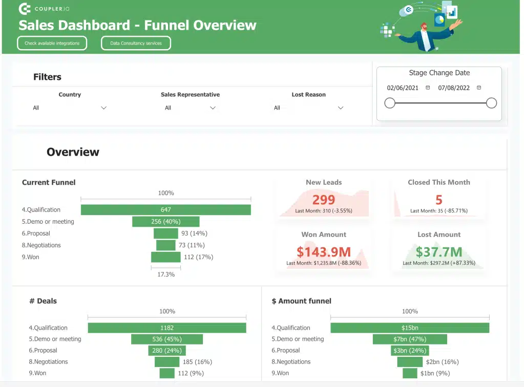
Having a comprehensive sales dashboard that tracks performance metrics like revenue, sales growth, and sales team performance is what the manager desires. It helps sales managers and executives monitor sales performance and make data-driven decisions.
This power BI sample dashboard is something which every sales team should keep in handy.
Data Sources:
- CRM systems (e.g., Salesforce) for customer and sales data.
- ERP systems for financial and inventory data.
- Point of Sale (POS) systems for transaction data.
Key Metrics:
- Total Revenue: The total income generated from sales.
- Sales Growth Rate: The percentage increase in sales over a specific period.
- Average Deal Size: The average revenue generated per sale.
- Sales by Region: Sales performance broken down by geographic area.
Pro: Provides real-time sales performance insights to drive strategic decisions.
Con: Can become cluttered with too many metrics.
4. Anomaly Detection in Credit Card Transactions Dashboard
This is yet another Power BI dashboard idea that detects and visualizes anomalies in credit card transactions to prevent fraud. It is essential for financial institutions and payment processors to identify and mitigate fraudulent activities.
Data Sources:
- Bank transaction databases for transaction records.
- Credit card processing systems for real-time transaction data.
- Fraud detection tools for anomaly detection algorithms.
Key Metrics:
- Number of Anomalous Transactions: The count of transactions flagged as suspicious.
- Fraud Detection Rate: The percentage of fraudulent transactions correctly identified.
- Average Transaction Value: The average value of credit card transactions.
- Suspicious Merchant Analysis: Identification of merchants with a high volume of suspicious transactions.
Pro: Enhances fraud detection capabilities with visual insights.
Con: Requires sophisticated algorithms and may produce false positives.
Need Inspiration for Your Next Report?
Discover innovative designs and metrics to enhance your Power BI reports.

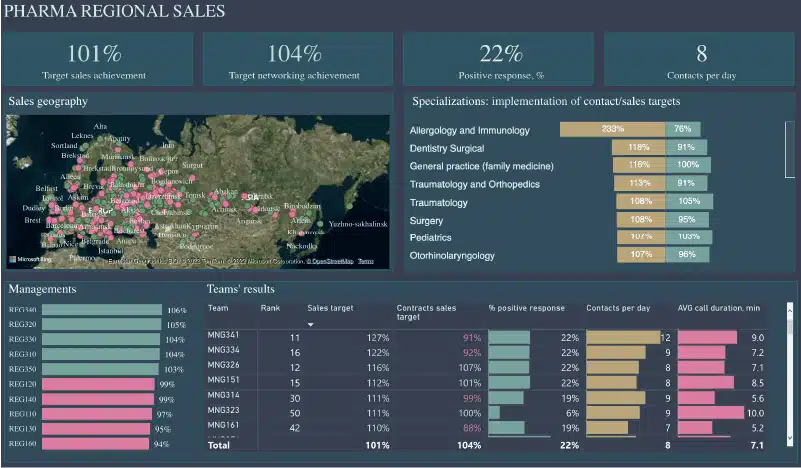
5. Pharmaceutical Company Dashboard
Tracks key performance indicators for pharmaceutical companies, including drug development stages, sales, and compliance. It helps manage the complex process of drug development and market performance.
Data Sources:
- ERP systems for financial and supply chain data.
- Clinical trial databases for research and development progress.
- Sales and marketing systems for market performance data.
Key Metrics:
- Drug Development Progress: The current stage of drug development for each product.
- Sales by Product: Sales performance broken down by pharmaceutical product.
- Regulatory Compliance Status: The compliance status with regulatory requirements.
- R&D Spending: The total expenditure on research and development.
Pro: Centralizes critical data for quick decision-making.
Con: Sensitive data needs strict security measures.
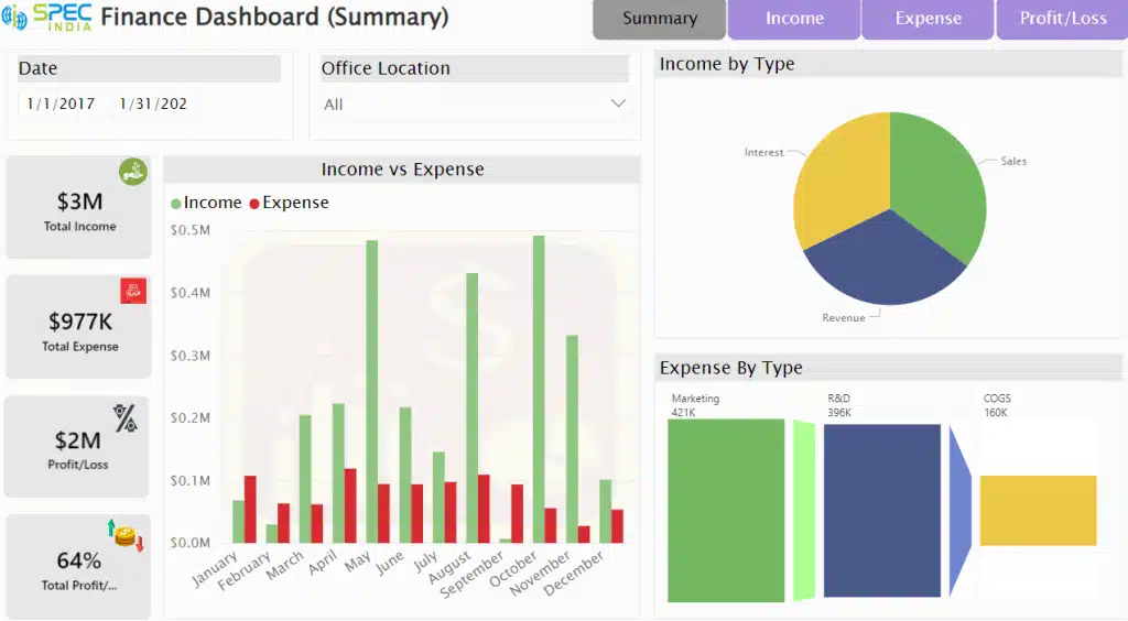
6. Financial Dashboard
A financial dashboard for tracking a company’s financial health, including income, expenses, and profitability. It helps finance teams and executives monitor financial performance and make informed decisions.
Data Sources:
- Accounting systems (e.g., QuickBooks) for financial records.
- ERP systems for comprehensive financial data.
- Financial reports for historical performance data.
Key Metrics:
- Revenue: The total income generated by the company.
- Net Profit: The profit after all expenses have been deducted.
- Expense Breakdown: The distribution of expenses across different categories.
- Cash Flow: The net amount of cash being transferred in and out of the business.
Pro: Provides a holistic view of financial performance.
Con: Requires accurate and timely data entry.
7. Loan Application Analysis Dashboard
A loan application analysis dashboard helps financial institutions by analyzing loan applications, approval rates, and risk assessments. This Power BI report aids in evaluating loan performance and identifying potential risk factors, providing a comprehensive view for better decision-making.
Data Sources:
- Loan management systems for application data.
- Credit scoring databases for creditworthiness information.
- Customer profiles for detailed applicant information.
Key Metrics:
- Approval Rate: The percentage of loan applications approved.
- Average Loan Amount: The average size of loans granted.
- Default Rate: The percentage of loans that default.
- Risk Assessment Scores: The risk levels assigned to loan applications.
Pro: Helps identify trends in loan approvals and defaults.
Con: Sensitive data needs to be managed securely.
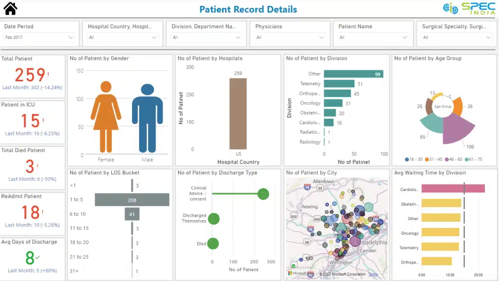
8. Patient Management Analytics Dashboard
This dashboard monitors patient data, appointment schedules, and treatment outcomes. It aids healthcare providers in managing patient care and improving service delivery.
Data Sources:
- Electronic Health Records (EHR) systems for patient data.
- Appointment scheduling software for managing patient visits.
- Patient feedback surveys for satisfaction and outcome data.
Key Metrics:
- Appointment Attendance Rate: The percentage of scheduled appointments attended.
- Patient Satisfaction Scores: Feedback from patients on their care experience.
- Treatment Success Rate: The effectiveness of treatments administered.
- Average Wait Time: The average waiting time for patients.
Pro: Improves patient care by tracking key health metrics.
Con: Requires strict adherence to privacy regulations.
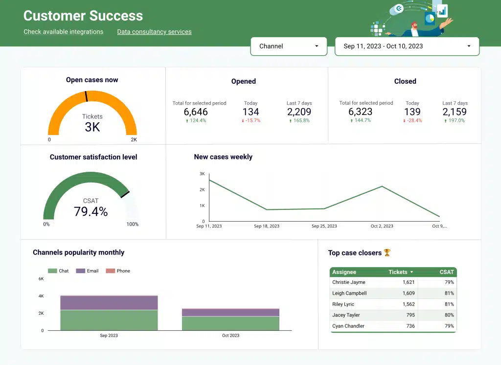
9. Operations Dashboard
An operations dashboard tracks key performance indicators (KPIs) for operational efficiency, such as production rates, inventory levels, and employee productivity. Operations managers in various industries, including manufacturing, logistics, and retail, use this dashboard to monitor and improve processes like supply chain management, quality control, and order fulfillment. This helps ensure smooth and efficient operations across different sectors.
Data Sources:
- ERP systems for comprehensive operational data.
- Manufacturing execution systems (MES) for production data.
- Supply chain management systems for logistics and inventory data.
Key Metrics:
- Production Efficiency: The ratio of actual output to the potential output.
- Downtime: The amount of time operations are halted.
- Order Fulfillment Rate: The percentage of orders completed on time.
- Inventory Turnover: The rate at which inventory is used and replenished.
Pro: Enhances operational visibility and efficiency.
Con: May require integration with multiple complex systems.
Also Read: How to Effectively Use Power BI for Inventory Management
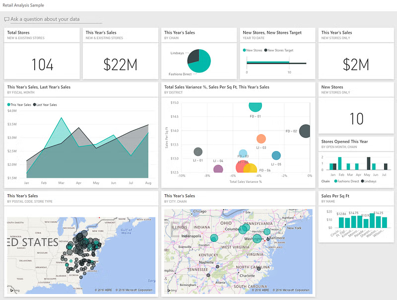
10. Retail Analysis
The Retail Analysis Dashboard is a tool that tracks retail performance, including sales trends, inventory levels, and customer behavior. This dashboard is useful for retail managers as it helps them optimize inventory and sales strategies, ensuring better decision-making and improved business outcomes.
Data Sources:
- POS systems for transaction data.
- CRM systems for customer information.
- Inventory management systems for stock levels.
Key Metrics:
- Sales by Product: The performance of individual products.
- Inventory Levels: Current stock levels of products.
- Customer Lifetime Value: The total revenue expected from a customer over their relationship with the business.
- Foot Traffic: The number of customers visiting the retail store.
Pro: Helps optimize inventory and improve customer experience.
Con: Requires frequent data updates to stay accurate.
Also Read: Power BI for retail store
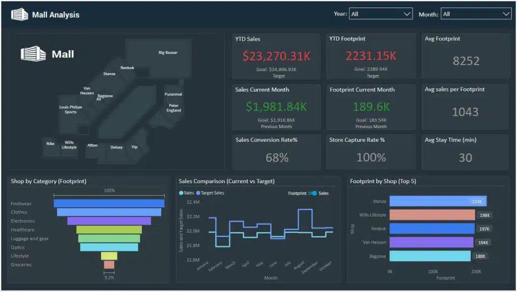
11. Mall Analysis
The Mall Analysis Dashboard is designed to analyze various aspects of mall performance, including store sales, foot traffic, and tenant occupancy. By providing detailed insights, it helps mall management make data-driven decisions regarding operations and leasing.
Data Sources:
- POS systems for sales data from stores.
- Foot traffic sensors for visitor data.
- Leasing management systems for tenant information.
Key Metrics:
- Store Sales: The revenue generated by stores within the mall.
- Foot Traffic: The number of visitors to the mall.
- Tenant Occupancy Rate: The percentage of leased spaces in the mall.
- Lease Expiry Dates: The dates when tenant leases are set to expire.
Pro: Provides insights into mall operations and tenant performance.
Con: Foot traffic data can be inconsistent.
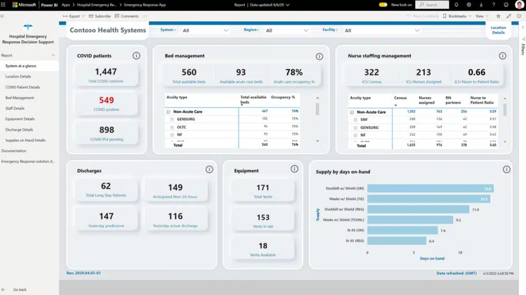
12. Healthcare Dashboard
A Healthcare Dashboard monitors key healthcare metrics, patient outcomes, and resource utilization. Healthcare administrators use this tool to improve patient care and operational efficiency. By providing a comprehensive overview of vital statistics, the dashboard helps identify areas for improvement, optimize resource allocation, and ensure better patient outcomes.
Data Sources:
- EHR systems for patient health data.
- Hospital management systems for operational data.
- Patient surveys for satisfaction and feedback.
Key Metrics:
- Patient Admissions: The number of patients admitted to the healthcare facility.
- Bed Occupancy Rate: The percentage of hospital beds occupied.
- Treatment Success Rate: The effectiveness of treatments administered.
- Resource Utilization: The usage rate of medical resources and equipment.
Pro: Enhances patient care and resource management.
Con: Requires compliance with healthcare regulations.
13. Property Developer Sales Analytics Dashboard
The Property Developer Sales Analytics Dashboard is designed to track property sales performance, monitor market trends, and oversee project progress. It provides property developers with valuable insights, enabling them to make informed decisions about their sales strategies and project timelines.
Data Sources:
- Real estate databases for market trends and property listings.
- CRM systems for sales data and customer interactions.
- Project management tools for tracking construction progress.
Key Metrics:
- Sales Volume: The number of properties sold.
- Average Property Price: The average selling price of properties.
- Market Trends: Analysis of real estate market conditions.
- Project Completion Rate: The progress of construction projects.
Pro: Helps make informed decisions on property development.
Con: Market data can be volatile and unpredictable.
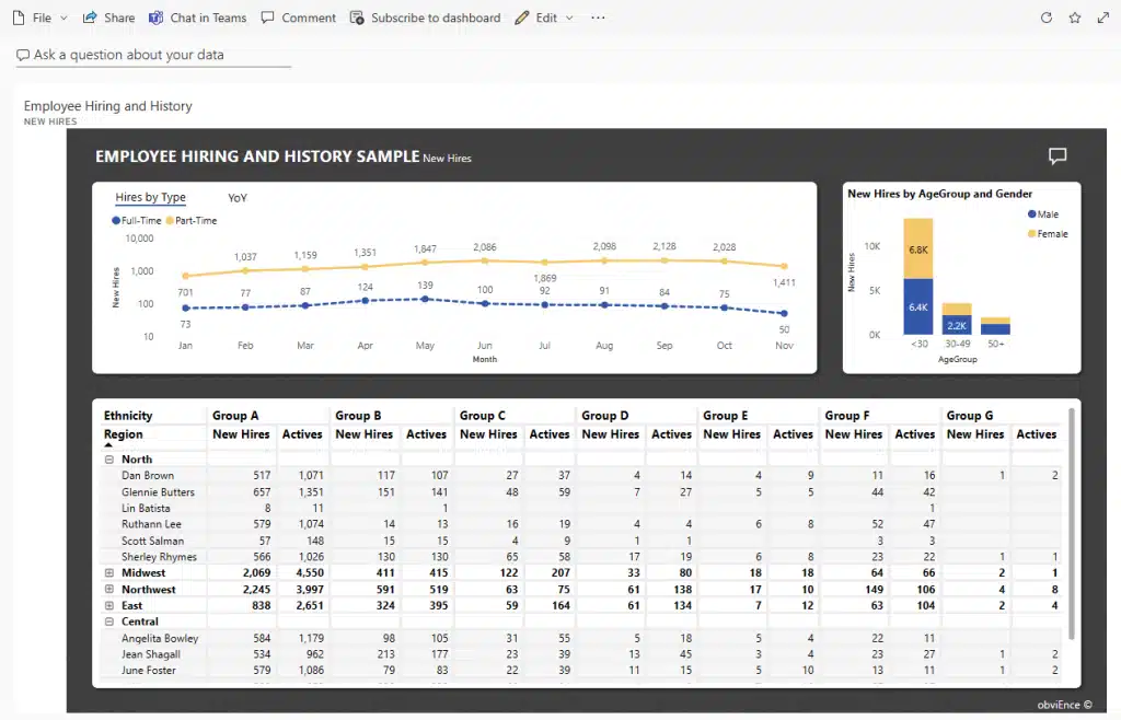
14. HR Dashboard
Analyze and monitor key HR metrics such as employee turnover, recruitment, and employee satisfaction with this Power BI report. It aids HR managers in managing workforce performance and engagement so that teams across the organization function in harmony.
Data Sources:
- HR management systems (HRMS) for employee records.
- Employee surveys for satisfaction and engagement data.
- Payroll systems for compensation data.
Key Metrics:
- Employee Turnover Rate: The percentage of employees leaving the company.
- Recruitment Efficiency: The effectiveness of the hiring process.
- Employee Satisfaction Score: Feedback from employees on their job satisfaction.
- Training Hours per Employee: The amount of training provided to employees.
Pro: Enhances HR decision-making and employee management.
Con: Sensitive employee data needs careful handling.
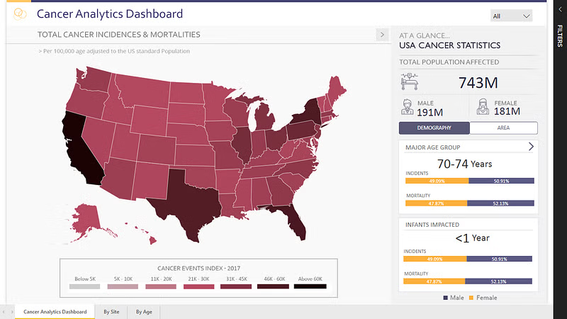
15. Cancer Analytics Dashboard
The Cancer Analytics Dashboard is designed to analyze cancer patient data, treatment outcomes, and research progress. It provides essential support to healthcare providers and researchers, helping them improve cancer treatment and patient care.
Data Sources:
- EHR systems for patient health and treatment data.
- Cancer registries for tracking patient outcomes.
- Clinical trial databases for research data.
Key Metrics:
- Patient Survival Rate: The percentage of patients surviving after treatment.
- Treatment Success Rate: The effectiveness of cancer treatments.
- Research Funding Allocation: The distribution of funding for cancer research.
- Clinical Trial Enrollment: The number of patients participating in clinical trials.
Pro: Supports research and treatment improvements.
Con: Sensitive data requires stringent privacy measures.
16. Ecommerce Sales Dashboard
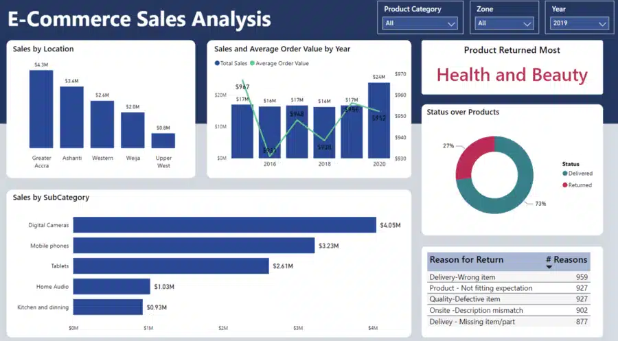
This ecommerce sales dashboard provides a detailed view of online sales performance, customer behavior, and inventory management. It helps ecommerce managers track sales trends and optimize their online store operations.
Data Sources:
- Ecommerce platforms (e.g., Shopify, WooCommerce) for sales and product data.
- Web analytics tools (e.g., Google Analytics) for user behavior and traffic data.
- Payment gateways (e.g., PayPal, Stripe) for transaction data.
Key Metrics:
- Total Sales: The total revenue generated from online sales.
- Average Order Value (AOV): The average amount spent per order.
- Conversion Rate: The percentage of website visitors who make a purchase.
- Inventory Levels: The current stock levels of products.
Pro: Provides real-time insights into online sales performance.
Con: Data accuracy depends on the integration and updating frequency.
17. PPC Dashboard
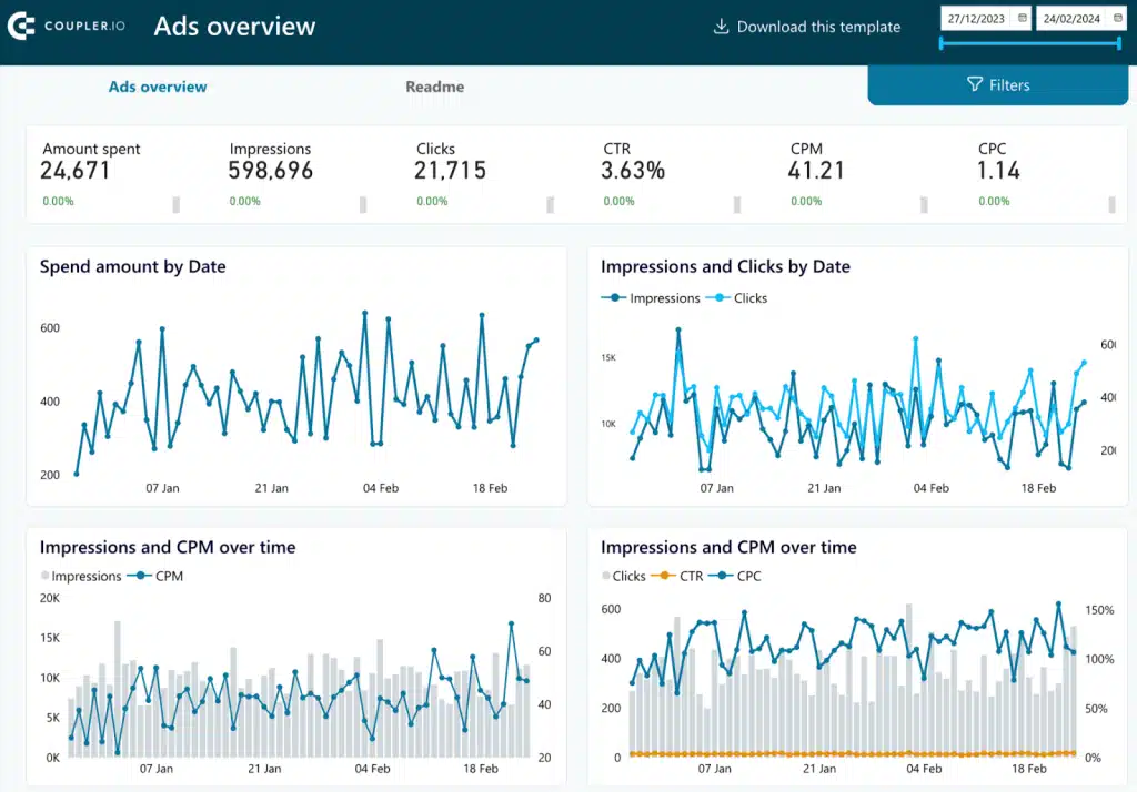
A PPC (Pay-Per-Click) dashboard tracks the performance of paid advertising campaigns across various platforms, providing marketers with valuable insights. By looking at this data, marketers can spend their ad money more wisely, get better returns, and make smarter choices to improve their campaigns.
Data Sources:
- Google Ads for campaign performance and cost data.
- Social media advertising platforms (e.g., Facebook Ads, LinkedIn Ads) for ad metrics.
- Web analytics tools for tracking conversions and user behavior.
Key Metrics:
- Click-Through Rate (CTR): The ratio of users who click on an ad to those who see it.
- Cost Per Click (CPC): The average cost incurred for each click on an ad.
- Conversion Rate: The percentage of clicks that result in a desired action.
- Return on Ad Spend (ROAS): The revenue generated for every dollar spent on advertising.
Pro: Helps in optimizing ad campaigns for better performance.
Con: Requires continuous monitoring and adjustments.
18. Customer Churn Analysis Dashboard
This dashboard helps businesses analyze customer retention and identify factors contributing to customer churn. It is a must-have for subscription-based businesses and those focused on customer loyalty.
Data Sources:
- CRM systems for customer data and interactions.
- Subscription management platforms for customer lifecycle data.
- Customer feedback tools for satisfaction and experience data.
Key Metrics:
- Churn Rate: The percentage of customers who stop using the product/service.
- Customer Lifetime Value (CLV): The total revenue expected from a customer over their relationship with the business.
- Renewal Rate: The percentage of customers who renew their subscriptions.
- Net Promoter Score (NPS): A measure of customer satisfaction and loyalty.
Pro: Provides actionable insights to improve customer retention.
Con: Can be complex to pinpoint the exact causes of churn.
19. KPI Dashboard
A KPI (Key Performance Indicator) dashboard tracks the critical metrics that align with a company’s strategic goals. It helps executives and managers monitor performance and make data-driven decisions.
Data Sources:
- ERP systems for financial and operational data.
- CRM systems for sales and customer data.
- HR management systems for workforce metrics.
Key Metrics:
- Financial Performance: Metrics like revenue, profit margins, and cash flow.
- Operational Efficiency: Metrics like production output, downtime, and order fulfillment rate.
- Customer Satisfaction: Metrics like NPS and customer satisfaction scores.
- Employee Performance: Metrics like employee turnover rate and training hours.
Pro: Provides a holistic view of organizational performance.
Con: Requires careful selection of relevant KPIs to avoid information overload.
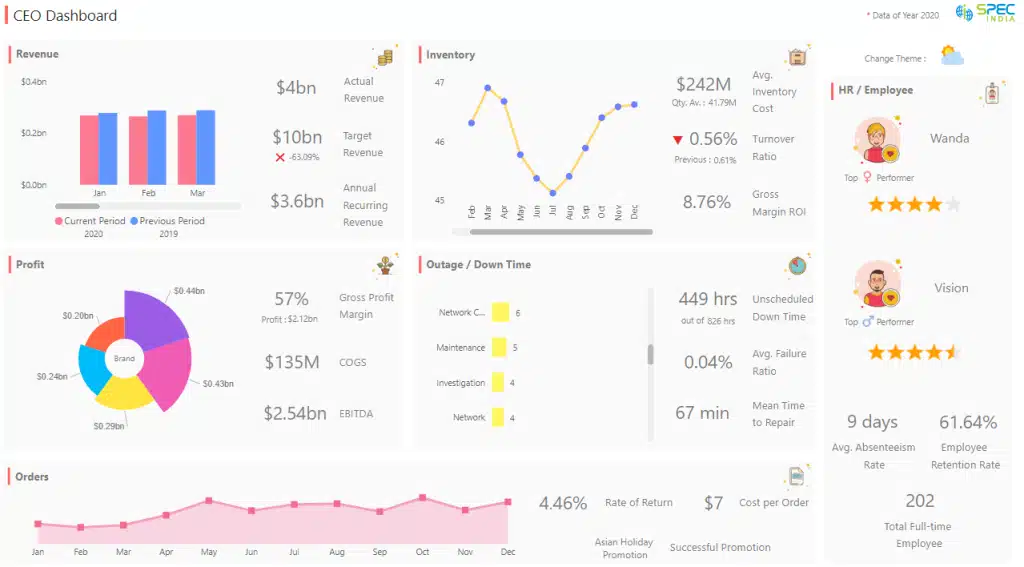
20. CEO Dashboard
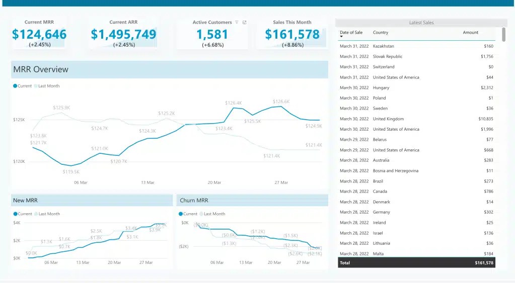
A CEO Power BI dashboard consolidates high-level metrics across different business functions and verticals, providing a comprehensive overview to the CEO on how the company is performing. It helps in strategic decision-making and tracking overall business health.
Data Sources:
- ERP systems for comprehensive financial and operational data.
- CRM systems for sales and customer data.
- HR management systems for workforce metrics.
Key Metrics:
- Overall Financial Performance: Revenue, profit margins, and cash flow.
- Key Strategic Initiatives: Progress and outcomes of major projects.
- Market Trends: Industry benchmarks and competitive analysis.
- Organizational Health: Employee engagement and turnover rates.
Pro: Offers a strategic overview for high-level decision-making.
Con: May oversimplify complex issues if not properly detailed.
Conclusion
Power BI reports are incredibly powerful and versatile tools that cater to a wide array of industries and functionalities. Whether it’s providing deep insights into marketing campaigns, optimizing operational efficiencies in manufacturing, detecting anomalies in financial transactions, or tracking patient outcomes in healthcare, Power BI delivers actionable intelligence through intuitive and interactive dashboards.
By integrating data from multiple sources, these Power BI report types can offer a comprehensive view that supports data-driven decision-making and strategic planning.
If you’re looking to harness the full potential of Power BI dashboards customized to your unique business needs, connect with ScaleupAlly. Our expert team is dedicated to delivering tailored BI solutions that drive performance and growth. Reach out to ScaleupAlly today and transform your data into powerful insights.
Frequently Asked Questions (FAQs)
Q: After seeing these examples, can I create similar reports in Power BI?
Yes, you can create similar reports in Power BI. Power BI is designed to be user-friendly, allowing you to import data from various sources, create interactive visualizations, and design reports tailored to your specific needs. There are plenty of online resources, tutorials, and documentation to help you get started.
Q: What makes a good Power BI report?
A good Power BI report is one that:
- Uses appropriate data visualizations to represent the data effectively.
- Allows users to interact with the data through filters and drill-down capabilities.
- Is regularly updated with the latest data.
Q: Are there report templates available for specific industries?
Yes, Power BI offers various templates tailored to specific industries, such as finance, healthcare, retail, and manufacturing. These templates can provide a solid starting point, allowing you to customize and adapt them to meet your specific requirements. Additionally, the Power BI community often shares templates and best practices for different industries.
Q: What are the most common data visualizations used in Power BI reports?
The most common data visualizations used in Power BI reports include:
- Bar and Column Charts: For comparing values across categories.
- Line Charts: For showing trends over time.
- Pie and Donut Charts: For displaying parts of a whole.
- Tables and Matrices: For detailed data and cross-tabular analysis.
- Maps: For geographical data representation.
- Cards and KPIs: For highlighting key metrics and performance indicators.
Q: Can I use AI to improve my dashboards?
Yes. Power BI supports Copilot AI to auto-suggest visuals, summarize trends, and generate natural-language queries.
Related Blogs

Data Warehouse Cost Breakdown: Factors, Pricing Models & Platform Comparison
Discover how much a data warehouse costs in 2025. Explore pricing models, key factors, and platform comparisons to plan your data budget effectively.
Tarsem Singh
Nov 6 ,
14 min read

How Much Do Integrations Cost? [Pricing Breakdown & Key Insights]
Learn how much integrations cost, key factors influencing pricing, hidden expenses to avoid, and effective ways to reduce integration costs.
Tarsem Singh
Nov 6 ,
9 min read
Power BI for Inventory Management: A Comprehensive Guide
Explore the hidden power of Power BI for inventory management and how it provides businesses with powerful analytics and visualization capabilities.
Tarsem Singh
Oct 8 ,
19 min read


