How Data Visualization Transforms Healthcare: Key Benefits & Tools
Tarsem Singh | July 31, 2025 , 9 min read
How Data Visualization Transforms Healthcare: Key Benefits & Tools
Tarsem Singh | July 31, 2025 , 9 min read
Table Of Content
There is so much data in Healthcare. Hospitals have patient records piled up and scattered across different systems with critical insights that nobody reads.
What if doctors could instantly spot patterns? What if hospital administrators could identify inefficiencies at a glance?
We can solve this using data visualization in healthcare. Overwhelming information will be transformed into clear, actionable insights to save lives.
It means simplifying medical information into visual formats that humans can quickly understand. Charts, graphs, and dashboards are examples that make sense of patient data and treatment outcomes.
The technology takes datasets from lab results, imaging studies, population health statistics, and operational metrics, then presents them in formats that support quick decision-making.
Healthcare drowns in data. There are piles of electronic health records, lab results, and Patient monitoring generates lots of data. Without proper visualization, this wealth of information becomes a burden. A single dashboard can reveal what thousands of spreadsheet rows cannot.
Consider the ICU nurse tracking vital signs across twenty patients. Raw numbers on a screen tell one story. Color-coded visual alerts tell another entirely. The difference? Lives saved through faster response times.
Hospital administrators face similar challenges. Budget reports, staffing metrics, patient satisfaction scores, etc, are all critical, and all overwhelming in traditional formats. Visual tools simplify this.
Data visualization makes information actionable.
The human brain processes visual information 60,000 times faster than text. In healthcare, speed equals survival. Every second counts when making critical decisions.
This is why leading medical institutions invest heavily in visualization tools. They understand that better data presentation leads to better patient care.
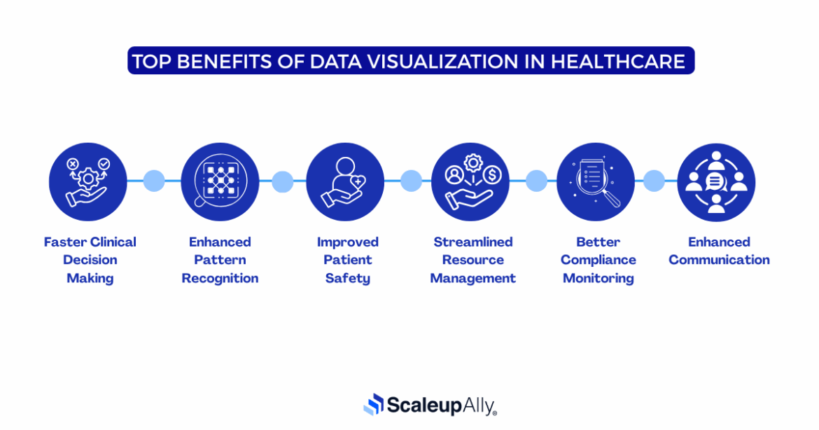
Here are the core benefits of data visualization in healthcare that are revolutionizing patient care and operations:
Speed saves lives. Visual dashboards present patient data that can be understood instantly. Doctors are able to spot critical changes without scrolling through pages of text. The convenience of data visualization in healthcare allows emergency teams to respond faster when alerts pop up visually. All these lead to treatment decisions that happen in minutes.
Visual analytics reveal trends hidden in raw data. Patterns of infection rates, medication responses, patient deterioration etc are a few health institutions would be able to notice. Disease outbreaks become visible before they spread. This way, healthcare teams catch problems early. Prevention becomes possible.
Medication errors drop when pharmacists see visual alerts. Surgery teams review 3D models before procedures. Risk factors stand out in colorful charts. Visual warnings prevent mistakes that text-based systems miss. Patient safety improves dramatically.
Hospital beds, staff schedules, and equipment usage can all be tracked visually. Administrators are able to spot bottlenecks instantly. Resources can then be allocated where they are needed most. When this happens, wait times shrink, and the institution becomes efficient.
Through visual tracking, regulatory requirements become manageable. Managers are able to see quality metrics on real-time dashboards. If there is a compliance gap, it shows up as a red flag. Therein, healthcare organizations can stay ahead of audits. Penalties become avoidable in this case.
This is a win-win for everyone. Doctors can share insights through clear visuals, patients would be able to understand their conditions better with charts and graphs, and medical teams can collaborate using shared dashboards. The end goal of this is that complex medical information becomes accessible to everyone involved.
Below are some uses of data visualisation in healthcare:
ICU dashboards track dozens of patients simultaneously. These include heart rates, blood pressure, oxygen levels, etc. They are all displayed in real-time visual formats. Nurses can spot dangerous trends instantly when it is highlighted this way. Critical care becomes proactive rather than reactive.
Patient histories spread across years of data. Visual timelines show medication changes, test results, and treatment outcomes. With such data, doctors are able to grasp complex medical stories at a glance. Treatment plans emerge from clear visual narratives.
3D reconstructions guide surgeons through complex procedures. In the same way, radiologists compare scans side-by-side using advanced visualization software. Brain tumors, bone fractures, or organ abnormalities are all revealed through sophisticated imaging tools.
When data in healthcare is visualized, disease outbreaks appear as heat maps across geographical regions. You will be able to spot vaccination rates, chronic disease prevalence, and health disparities. Public health officials will be able to track epidemics in real-time.
Drug trials generate massive datasets. Visual analytics reveal efficacy patterns, side effects, and patient responses easily. Researchers will be able to spot correlations that statistical tables cannot convey. With clear visual evidence, new treatments are most likely to emerge.
Infection rates, readmission statistics, and patient satisfaction scores will appear on executive dashboards. Then Quality teams would identify improvement opportunities through trend analysis. Performance metrics drive organizational change.
These data visualization tools in healthcare deliver the power and security that medical environments need.
Medical centers love Tableau’s drag-and-drop simplicity. Complex patient data can be transformed into interactive dashboards in minutes. Hospital administrators track everything from bed occupancy to surgical outcomes. The integration with electronic health records happens without coding.
Power BI fits naturally into healthcare IT ecosystems. Most hospitals already use Microsoft products. The learning curve stays minimal. With Microsoft Power BI, real-time patient monitoring becomes accessible to non-technical staff. Cost-effectiveness appeals to budget-conscious administrators.
Emergency departments use QlikView’s associative data model to integrate patient information from different systems in real time. This means doctors can see a full view of a patient’s medical history without switching between apps. It also helps uncover hidden patterns in complex medical data, making it easier to spot issues and make faster decisions.
Research hospitals choose SAS for advanced statistical capabilities. Clinical trials generate massive datasets that require sophisticated analysis. The platform handles predictive modeling for patient outcomes. Academic medical centers use it for population health research.
Epic dominates electronic health records. Their built-in visualization tools integrate seamlessly with patient data. No external connections required. Clinical workflows remain uninterrupted. Many healthcare systems prefer this all-in-one approach.
Healthcare visualization isn’t theoretical. It’s happening right now in hospitals, clinics, and research centers worldwide. These examples show how visual data transforms patient care.
The pandemic made data visualization a household concept. Johns Hopkins created the world’s most-watched health dashboard during the COVID-19 pandemic. The dashboard showed global case counts, death rates, vaccination progress. All these were being updated in real-time. Government officials made policy decisions based on these visuals.
The Cleveland Clinic built visual early warning systems that scan patient data continuously for sepsis. When multiple indicators align, the system triggers visual alerts. Then, red flags appear on nursing stations. Response teams mobilize within minutes. Sepsis mortality dropped significantly after implementation.
Managing 12 million patients requires sophisticated visual tools. Kaiser uses heat maps to track diabetes rates across different communities, enabling resources to be deployed where they’re needed most. This approach improves preventive care through targeted interventions.
Pharmaceutical research generates overwhelming datasets. Mount Sinai, with its data, uses interactive visualizations to explore genetic data, protein interactions, and drug responses. Researchers spot promising compounds through visual pattern recognition. Such findings lead to clinical trial designs that improve through better data exploration.
Intermountain built visual dashboards that track expenses across their entire network. Supply costs, staffing efficiency, and revenue cycles become transparent. Administrative teams make data-driven decisions. Waste gets eliminated through visual accountability.
Healthcare generates millions of data and visual tools will provide insights needed to save lives.
Organizations that embrace data visualization gain better patient outcomes, faster decisions, reduced costs, and enhanced safety. The transformation is here.
Contact us today to discover how the right tools can improve your patient care.
Q: How does healthcare use data visualization?
Hospitals track patients through visual dashboards. Doctors review charts that show trends over time and research teams spot patterns in drug trials. It’s everywhere now.
Q: How does data visualization improve patient care?
Nurses catch problems faster when alerts pop up visually. Doctors make quicker decisions with clear charts. Patients understand their test results when shown simple graphs instead of confusing numbers.
Q: What are some top tools for visualizing healthcare data?
Tableau works great for most hospitals. Power BI costs less and integrates with Microsoft systems. Epic has built-in tools if you’re already using their records system. SAS handles complex research data well.
Q: What challenges do healthcare providers face with data visualization?
Privacy policies make everything complicated. Legacy computer systems don’t play nice with new visualization tools. Medical staff may need training on unfamiliar software. Also, getting different departments to share data remains a nightmare for most organizations.

Related Blogs

Data Warehouse Cost Breakdown: Factors, Pricing Models & Platform Comparison
Discover how much a data warehouse costs in 2025. Explore pricing models, key factors, and platform comparisons to plan your data budget effectively.
Tarsem Singh
Nov 6 ,
14 min read

How Much Do Integrations Cost? [Pricing Breakdown & Key Insights]
Learn how much integrations cost, key factors influencing pricing, hidden expenses to avoid, and effective ways to reduce integration costs.
Tarsem Singh
Nov 6 ,
9 min read

Power BI for Inventory Management: A Comprehensive Guide
Explore the hidden power of Power BI for inventory management and how it provides businesses with powerful analytics and visualization capabilities.
Tarsem Singh
Oct 8 ,
19 min read